WEB BUTTONS HOW TO'S
 How To's
 Css Pull Down Menu
 Css Menu Popup
 Html Pull Down Menu Code
 Css Dropdown Menu Template
 Flyover Menu
 Dynamic Side Menu
 Transparent Dropdown Menu Jquery
 Dropdown Menu In Dreamweaver Cs
 How To Create Menu Html
 Creating Sub Menus Using Javascript
 Make A Menu In Bash
 Simple Menu And Submenu Using Javascript
 Expandable Verticle Menu
 Dropdown Menu In Bash
 Windowclass Popupmenu
 Javascript Submenu
 Features
 Online Help
  FAQ
FAQ
QUICK HELP
Save your menu.
CREATING A FLYOUT MENU
Web buttons and icons properties Text - type the submenu's item text here. If you leave the field clean then the linked page will be opened in the same browser window.
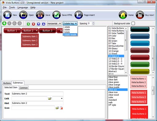
This toolbox is for adjusting submenus properties. When you change submenu properties all submenus in the menu will be changed.


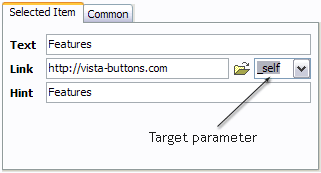
Link - the link that is to be opened when user clicks the item. For example: http://www.vista-buttons.com. You can also click "Open" icon to the left of the "Link" field to select the page you want to link to.
Link target attribute - link behavior adjustment. Link target attribute tells web-browser where to open the linked page. This attribute represents the Target attribute of the link (<a> tag in HTML). You can either enter your target value in the field or choose from the predefined attribute values in the list.
If you enter your own value, it must be a window or a frame name. Note, that names are case-sensitive. The linked document will then be opened in that window/frame.
Predefined attribute values:
Hint - specifies the tooltip that is shown when you hold the mouse over the item for a few seconds.
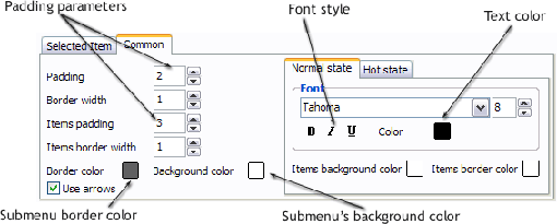
Padding parameters - If you want to specify padding around the whole submenu you should set Padding parameter. If you want to specify padding around submenu items you should set Items padding parameter.
Border width - Set Border width parameter if you want to specify border around the whole submenu. If you want to specify border width around each submenu's item you should set Items border width parameter.
Border color - set border color around the whole submenu.
Background color - set background for the whole submenu.
DESCRIPTION
Good navigation system is an important part of web site success. If people can't find their way around the site, they will rapidly give up looking and go, never to return. So, it's very significant that your website has a neat, fast, and
Don't permit your web site visitors to get lost. Try Drop Down DHTML Menu!
Vista-style menus Como Poner Un Template En Una Pagina De Internet Web menus, which are created by Drop Down HTML Menu, exactly correspond with Windows Vista graphic interface components. That is why the visitors of your site will not have to spend their time in order to familiarize with the unusually-looking navigation. Nevertheless, you are not limited by the standard Windows themes, and you will be able to create your own original buttons. Easy, quick, professional Dhtml Tree Menue Cross Browser Its very easy to create professional high-quality web buttons with the help of Dropdown DHTML Menu. Once installed you�ll be making buttons for your web site with no programming or drawing required. Ajax Transition Sliding Menu Creating A Flyout Menu Extended capabilities to save and export the results
RELATED
MENU SAMPLES
Vista Style 8 - Menu ButtonsTabs Style 2 - Web Buttons
Css Navigations Script XP Style Metallic - Web Design Graphics
Common Style 2 - Navigation Buttons
Vista Style 4 - 3d Buttons
Vista Style 2 - Web Button
Vista Style 5 - Animated Buttons
Javascript Right Click Custom Menu
Vista Style 10 - Button Graphics


